-
 E-COMEcommerce Solutions | Food & DrinksPOSTCARDVISIT THIS PROJECT
 -
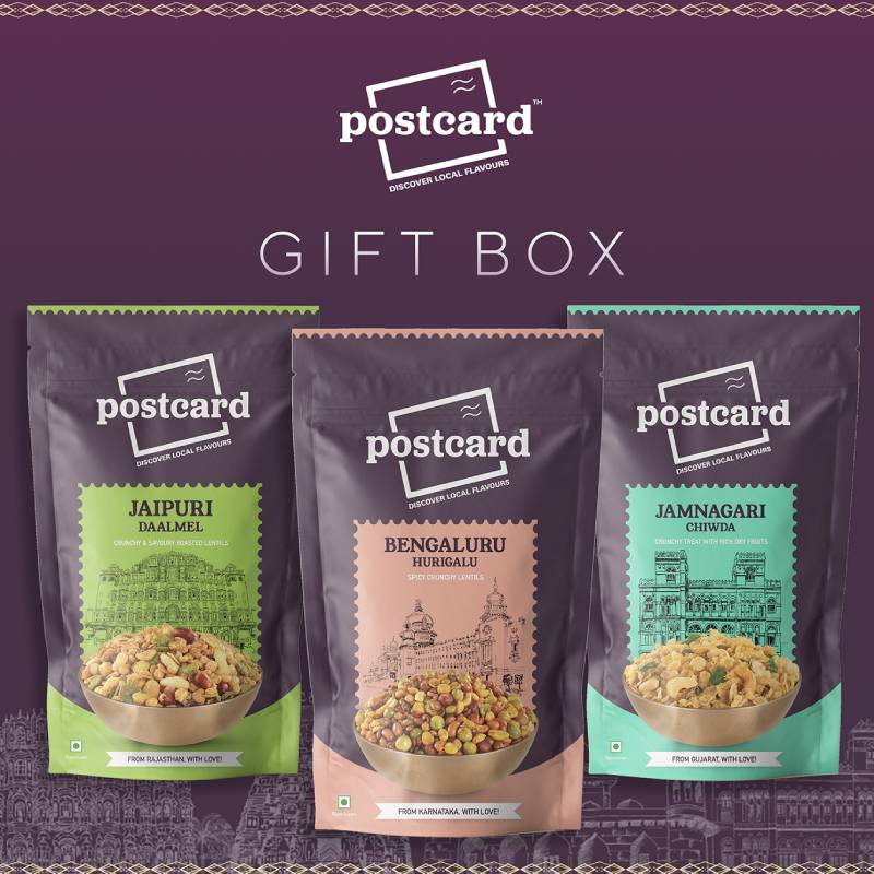
 E-COMPOSTCARDBACK TO PROJECTVIEW WEBSITEThe brand that standouts not just by its quirky
, but also by the products it showcases is
"Postcard" India is a place of culture, diversity, and
this isn't just confined to culture, language, but
also spans to cuisine. Moreover, India is world
renowned when it comes to street food,
especially chats, kachori, Namkin, pickle and
what not. The best part about this website is that
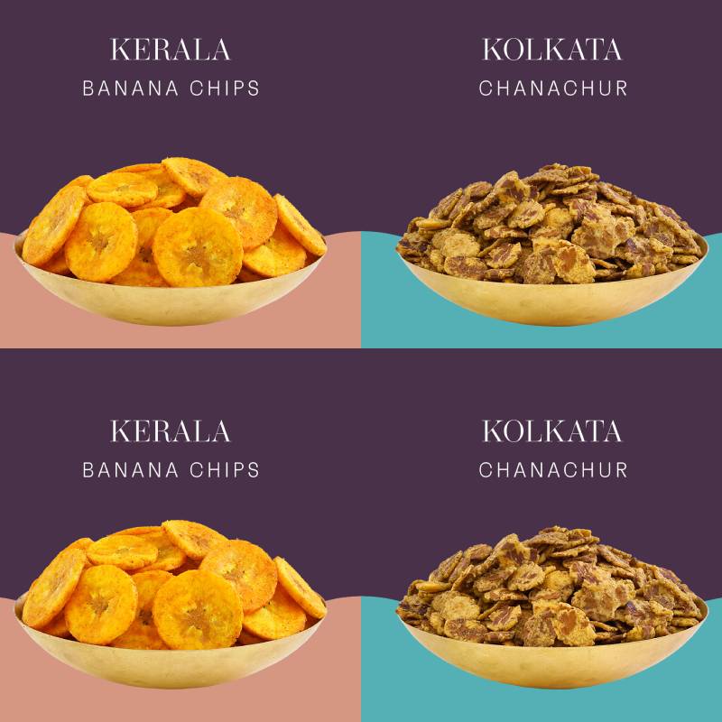
it categories various snacks as per their origin.


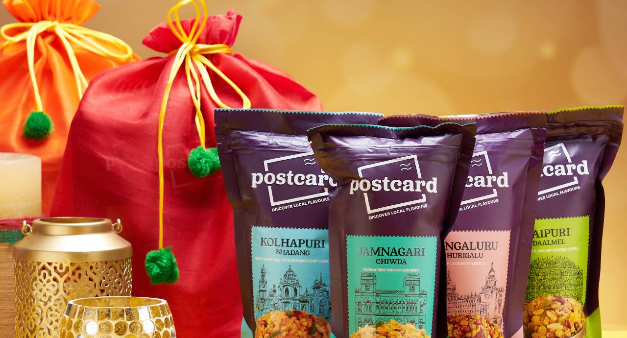
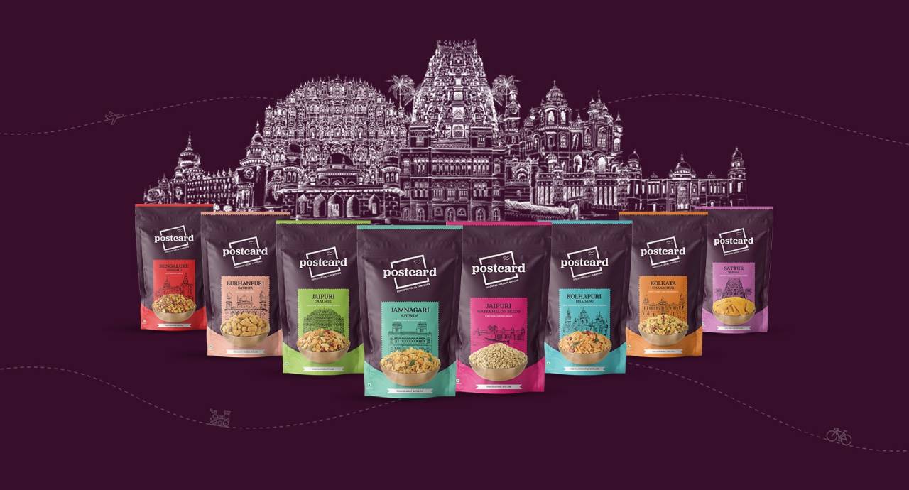
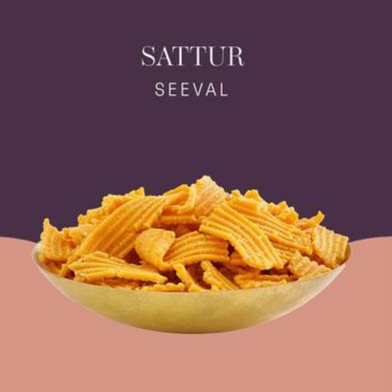
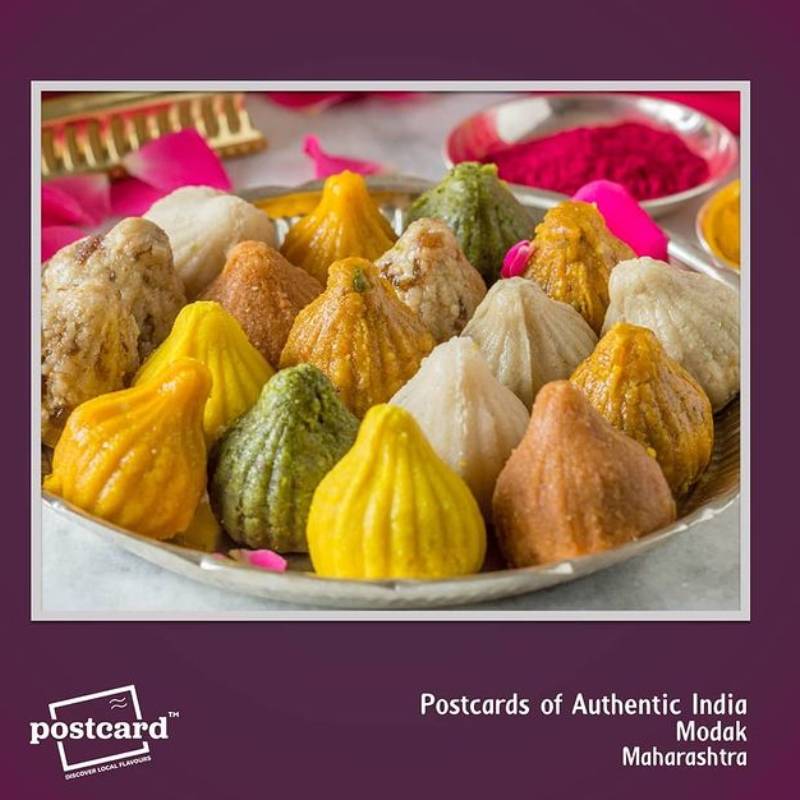
The brand that standouts not just by its quirky name, but also by the products it showcases is “Postcard” India is a place of culture, diversity, and this isn’t just confined to culture, language, but also spans to cuisine. Moreover, India is world renowned when it comes to street food, especially chats, kachori, Namkin, pickle and what not. The best part about this website is that it categories various snacks as per their origin. This makes it easy for the people to navigate through the menu and even learn what snack stems from what region.
The food manifests authentic regional taste without any manipulation. The delicious food/ Snack is attributed to the concoction of various condiments; that makes you drool and devour.
Being such a great platform for gratifying your tingling taste buds, Digital Impression got the opportunity to make a website for this brand. The layout and theme for the website was chosen after a brainstorming session, so that they resonate with idea of the website. The Platform Shopify was used to design and develop the website. The UI, UX was tested twice to give the users a remarkable experience. Another service rendered was Maintenance; really important to keep the website in the state it was in the beginning. From product uploads to fixing of bugs, change of banners every month, everything was taken care of.
PROJECT FAQ
Questions about POSTCARD
Who designed and developed the Postcard India website?
Digital Impressions designed, developed and maintained the Postcard India eCommerce website documented on this project page.
Which platform was used for the Postcard website?
The project narrative identifies Shopify as the platform used to design and develop the recorded website.
What products and story did the site organise?
The page describes authentic Indian snacks including chaat, kachori, namkeen and pickles, organised around their regional origins.
How did regional navigation support customers?
Products were grouped by place of origin so visitors could browse the catalogue and understand where different snacks came from.
How were the layout and theme selected?
The case study says the layout and theme followed a brainstorming session intended to align the interface with the brand and its regional-food proposition.
How was the UI and UX tested?
The project narrative records two rounds of UI and UX testing before the shopping experience was finalised.
What did website maintenance include?
Maintenance covered product uploads, bug fixes and monthly banner changes so the regional-food catalogue and storefront presentation stayed current.
Where can I explore related Shopify and food eCommerce work?
Browse our food and drink projects, see all Digital Impressions work, or explore eCommerce website development and eCommerce marketing.
More Projects




Let’s chat...
AS SEEN ON









awards

Excellence
in Digital Marketing
Women CPO
of the year 2023
Transformational
Leaders to Watch
Most Trusted
Companies


-

INDIA
NCR
+91-9811348433 Digital Impressions (INDIA)
29-36 LGF, Charmwood Plaza,
Delhi NCR - 121009
India
-

INDIA
GURUGRAM
+91-9811348433 Digital Impressions (INDIA)
4th Floor, JMD MEGAPOLIS, FF-402,
Badshahpur Sohna Rd, Sector 48,
Gurugram, Haryana 122018
India
-

USA
ATLANTA, GEORGIA
Digital Impressions (USA)
1445 Woodmont Ln NW,
4515 Atlanta Georgia - 30318
United States
-

UAE
DUBAI, UAE
+971-545502300 Digital Impressions (FZCO)
72819, IFZA Business Park, A1
Dubai Silicon Oasis - 342001
UAE


