-

 WEBSITEWebsite Solution | Buisness & FinanceQUERCUS ASSOCIATESVISIT THIS PROJECT
 -

 WEBSITEQUERCUS ASSOCIATESProviding strategic and investment advice in emerging markets. Connecting investors to opportunities.BACK TO PROJECT
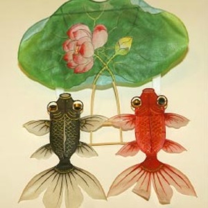
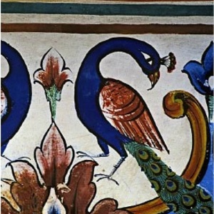
The identity for an advisory company that specialises in investment advisory in the world’s emerging markets, is a stylised representation of the Oak tree leaf (Quercus is Oak in Latin). The Red and gold palette were chosen as are the main Logo colours to reach out to an audience in the East, where the colours are considered auspicious. A simple grid and navigation was designed for the website which carried positive visuals of China, India and London to show the progressive markets for investment.
More Projects
Let’s chat...
but, you first!
AS SEEN ON


awards

Excellence
in Digital Marketing
Women CPO
of the year 2023
Transformational
Leaders to Watch
Most Trusted
Companies


